2025 · Lead Designer · Case Study No. 2
Technical Views Redesign
Modernising a technical-analysis product built on a hard constraint: the charts are images — and always will be.
Technical Views was outdated and confusing. The product delivers technical analysis for Forex, crypto, stocks, indices, and commodities — but its charts aren't interactive. They're static images, retrieved by the minute at a set of fixed widths. Making the chart interactive was off the table. This constraint shaped every decision that follows.
The old layout was a classic master-detail: a list of instruments on the left, details on the right. You couldn't see a single chart until you clicked into an instrument. In a product whose entire value is the chart, the chart was hidden behind a click.
Chart-first homepage
We replaced the list with a card grid. Every card leads with its retrieved chart image, plus target, support, and pivot levels — with directional arrows and bullish/bearish colour coding — and a trade button right on the card. Tabs split the universe by asset class: Forex, crypto, stocks, indices, commodities. The value of the product is now visible before a single click.
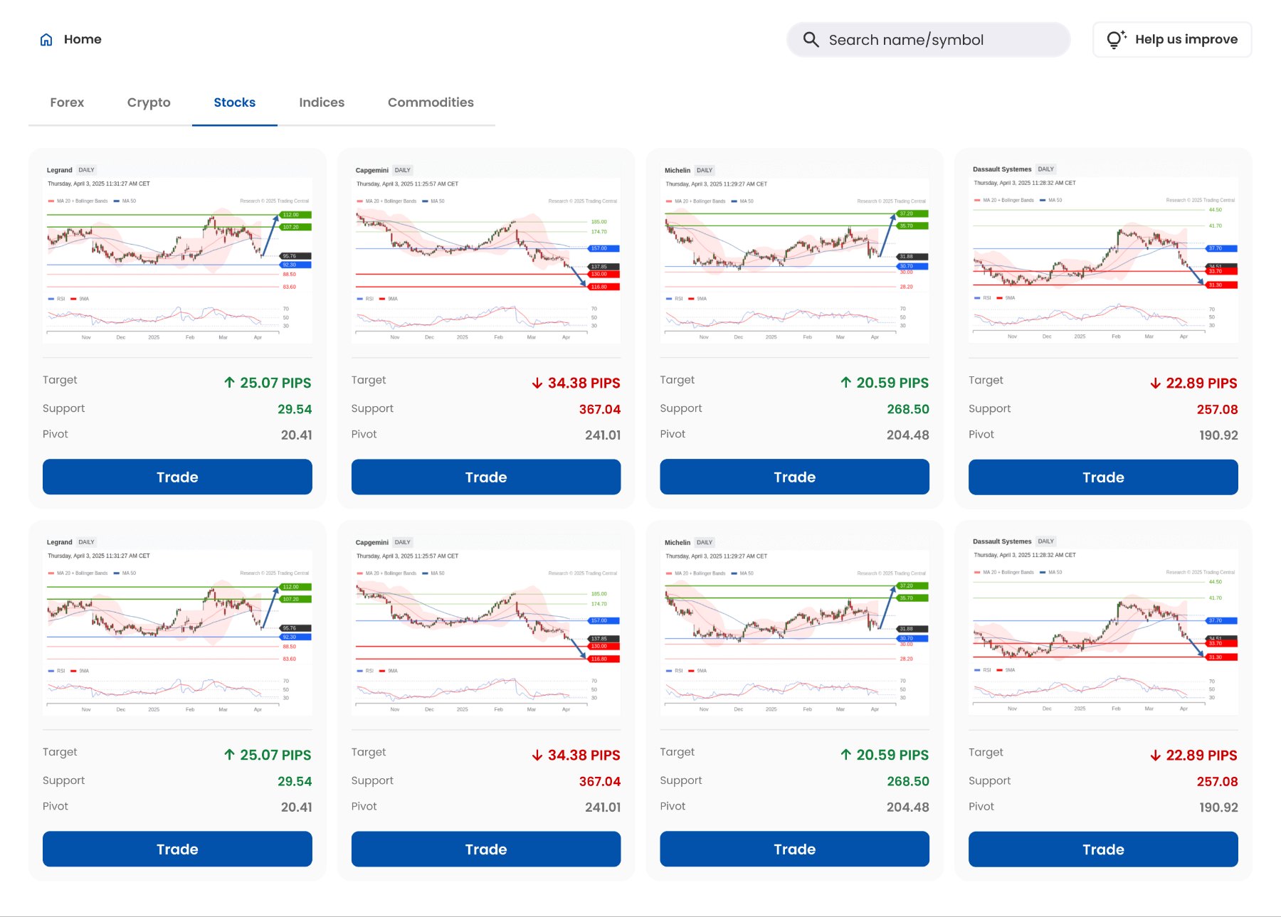
A detail page built for reading numbers
Clicking a card opens the full view: the chart at its largest size for the viewport, with intraday / daily / weekly tabs (same arrow + colour system), and a structured right-hand panel — target levels, pivot levels, support levels, the company's preference, commentary, and the alternative scenario — with the trade button in reach.
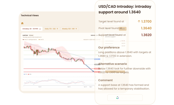
Images pretending to be responsive
You can't just width: 100% a chart full of small numbers — upscaling blurs the exact values users came to read. So the real design work was an image-delivery spec, negotiated with engineering, mapping every viewport range to the chart asset it should load and how it's allowed to scale:
| Viewport | Chart asset | Scaling rule |
|---|---|---|
| ≤ 359px | 359px | Proportional up/down scaling allowed for readability |
| 360 – 590px | 590px | Slight up/down scaling for best fit |
| 591 – 738px | 738px | Downscaling only — never upscale |
| 739 – 850px | 850px | Downscaling only |
| 851 – 929px | 929px | Fits precisely or scales slightly down |
| ≥ 930px | 929px | No scaling. Fixed width, intentional whitespace right |
The logic: below 590px, minor scaling costs almost nothing in quality and prevents horizontal scrolling. Above it, only downscaling is permitted — sharpness wins. And past 930px the image locks at its native size, aligned left, with deliberate whitespace instead of a blurry stretched chart.
The product's value was invisible
Charts — the whole point — were hidden until users clicked each instrument.
Chart-first cards with levels, direction, and a trade action surfaced immediately, organised by asset-class tabs.
Users evaluate instruments at a glance instead of click-hunting; the path from "open app" to "informed decision" collapsed.
Static images fought every screen size
No interactivity allowed, six chart widths, dozens of devices.
The breakpoint delivery spec above — precise asset-to-viewport mapping with strict scaling rules, co-designed with engineering.
Sharp, readable charts on every device, no horizontal scrolling, no blur — the constraint became invisible to users.
Dense analysis exhausted the reader
Levels, scenarios, and commentary arrived as undifferentiated text.
Bullish/bearish colour coding with directional arrows across cards, tabs, and detail panels — meaning lands before reading does.
Users parse direction instantly; the structured panel turns analysis into a scannable checklist rather than an essay.
Overall: drop-off fell 20% and engagement rose 8% after release.
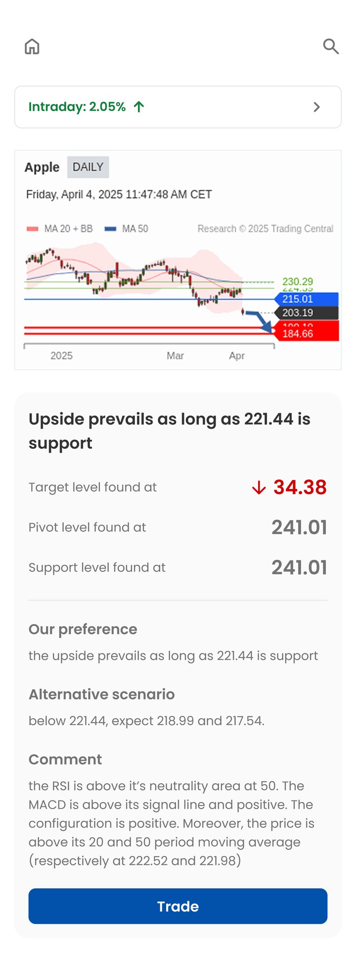
The redesign became a platform. After the AI Storyteller launch, its button was integrated into Technical Views — the two products now cross-pollinate. A Learning Center followed, explaining how the analysis model works, because trust in the output starts with understanding where it comes from.
Constraints don't have to show. The best compliment this redesign gets is that nobody notices the charts aren't interactive.
Anna ✎