2026 · Lead Designer · Case Study No. 3
Sentiment Monitor Experience
Fitting three data stories into one chart — without losing the reader.
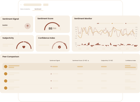
The original Sentiment History was a plain chart with exactly one job: show how sentiment around a stock was growing. Useful, but shallow — and the analyst team requested something far more powerful: a MACD-style sentiment chart.
That request tripled the data. The new chart had to carry:
- Sentiment Trend — the MACD line itself.
- Price — the market line to read sentiment against.
- Sentiment Score — a histogram of the difference between the lines.
Three series. Three value axes, plus time. One chart that mobile and desktop users both need to read at a glance. This is an information-design problem before it's a UI problem.
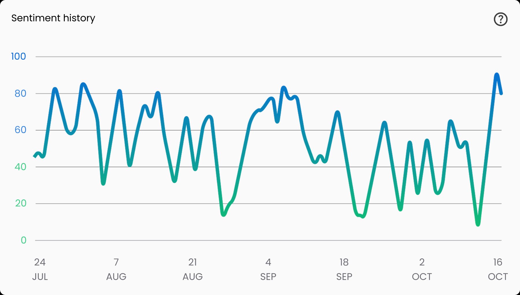
Cramming three axes into one plot was never going to read. So the chart became a stacked composition:
- Upper chart: Sentiment Trend and Price together — trend anchored to the left Y-axis, price to the right. The two lines users compare most live in the same space.
- Lower chart: the Sentiment Score histogram on its own baseline, colour coded bullish/bearish, out of the lines' way but sharing the same timeline.
One X-axis of time ties the whole story together vertically.
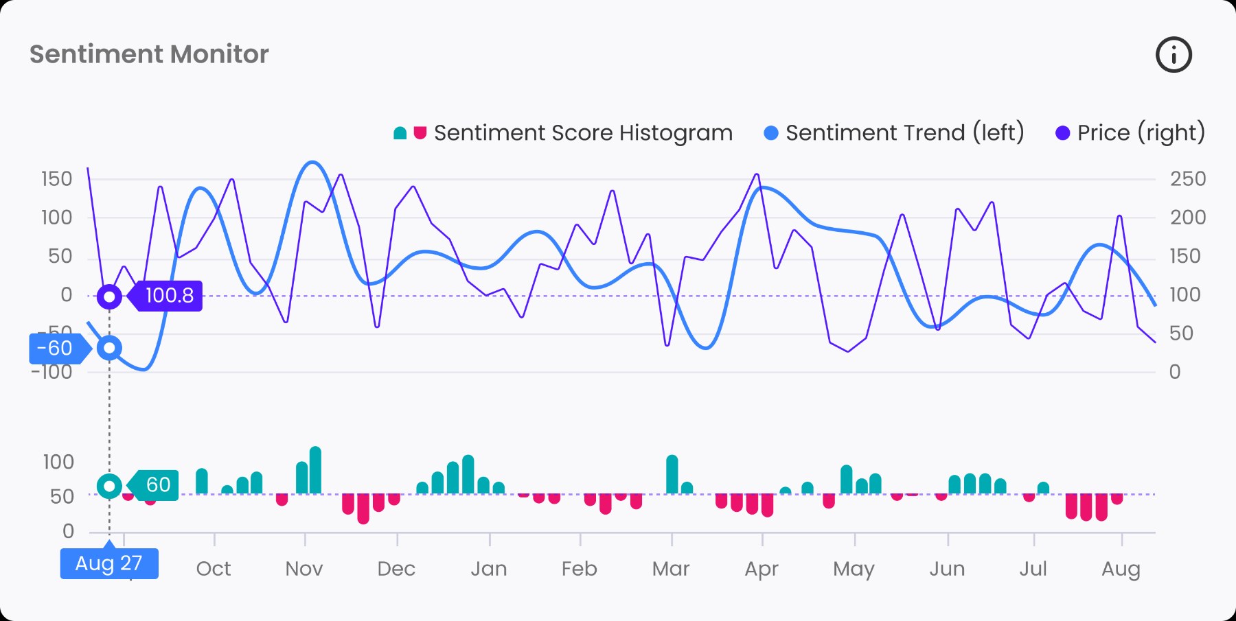
Hovering with three truths
Traders don't read charts approximately — they want the exact value at the exact moment. The hover interaction had to answer for all three series at once: touch any line, and a vertical crosshair reveals the trend value, the price, and the histogram value at that timestamp. Hover the price line, still see everything. One gesture, the complete picture.
Then the edge cases started biting.
Values colliding with the axes
Hover near the chart's edges and the value tags crash into the Y-axis labels. The fix was side-anchoring: each tag appears on the side of the crosshair that matches its axis — sentiment trend tags to the left of the line, price tags to the right. At the extreme left, the trend tag may overlap its own axis — an accepted imperfection, because the exact value stays legible, which is the entire point. The price tag, living on the right, never collides at all.
Colour alone couldn't carry the mapping
For colour-blind users, "the blue line goes with the left numbers" is meaningless. So the legend spells it out in words: Sentiment Trend (left) and Price (right). Position language instead of colour language — redundant coding that costs nothing and excludes no one.
Three series fought for one space
A MACD chart demands trend, price, and histogram — three axes' worth of data.
Stacked composition — lines above with split left/right axes, histogram below on its own baseline, one shared timeline.
Each series stays legible at a glance; the chart reads as one story, not three overlapping ones.
Precision reading required three hovers
Users needed exact values, but per-line tooltips meant hunting.
A single vertical crosshair that surfaces all three values at that timestamp, whichever line you touch.
One gesture delivers the complete picture — no hover hunting, no mental cross-referencing.
The axis mapping excluded people
Colour-blind users couldn't associate lines with axes, and edge hovers collided with axis labels.
Legend labels written as "(left)" and "(right)", plus side-anchored value tags that mirror their axis position.
The mapping works in words and position, not just colour — and edge collisions resolved everywhere it matters.
Overall: the new chart serves 27% more users, 34% better.
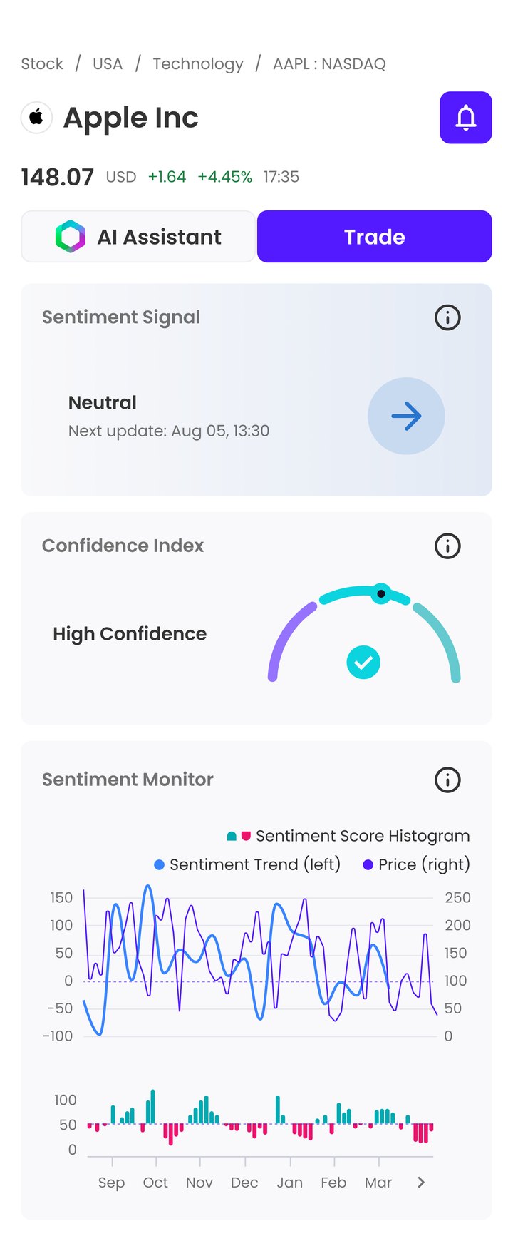
Dense data doesn't need a simpler chart. It needs a chart where every pixel knows which question it's answering.
Anna ✎