2025 – Present · Lead Designer · Case Study No. 4
Pulse Design System
A living design system for fintech — where "primary, secondary, error" was never going to be enough.
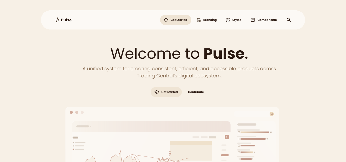
When I joined, the dev teams built everything on Angular Material — preset components that don't allow much customisation. Fine for a generic app; suffocating for a data-heavy fintech product family.
The strategy isn't a big-bang replacement. We migrate selectively: a component earns a custom version only when the need is proven and the customisation requirements outgrow what Angular Material allows. Until then, we use the preset and override as little as possible — every override is debt.
The ultimate goal: components so reusable that one day we stop needing to make new ones. The system reaches completeness not by being big, but by being tailored.
Why a "normal" design system doesn't survive fintech
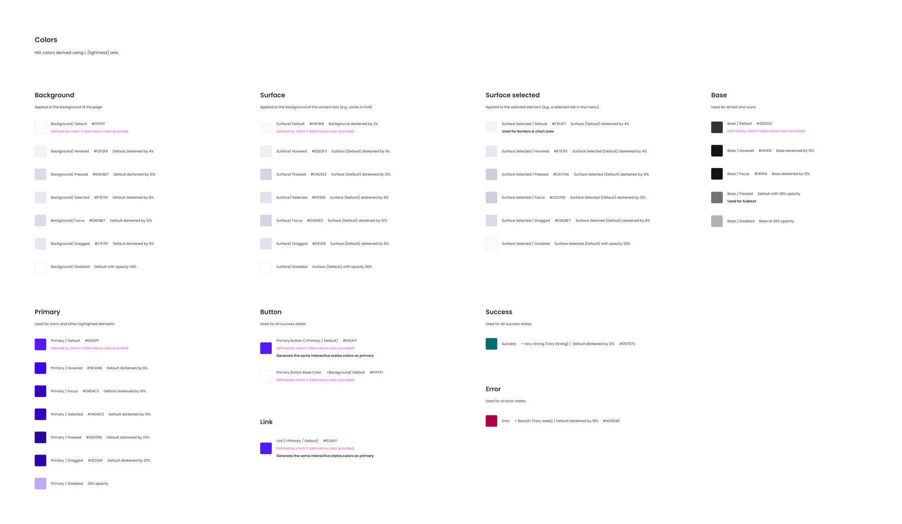
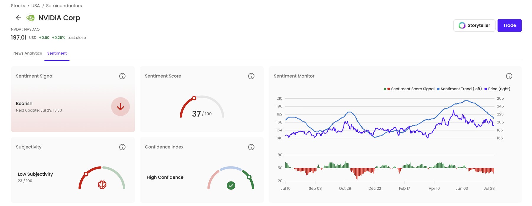
A typical palette — primary, secondary, some greys, an error red — collapses on contact with a trading product. Pulse's colour system has to describe:
- Foundations: background, surface, primary, base text.
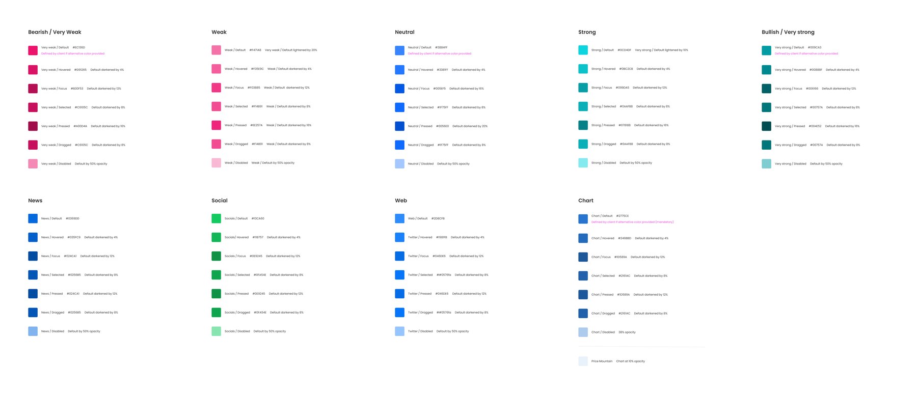
- Market semantics: bearish · weak · neutral · strong · bullish.
- Content domains: news, social, web.
- An entire dedicated chart colour set.
And then localisation breaks the "obvious" shortcuts:
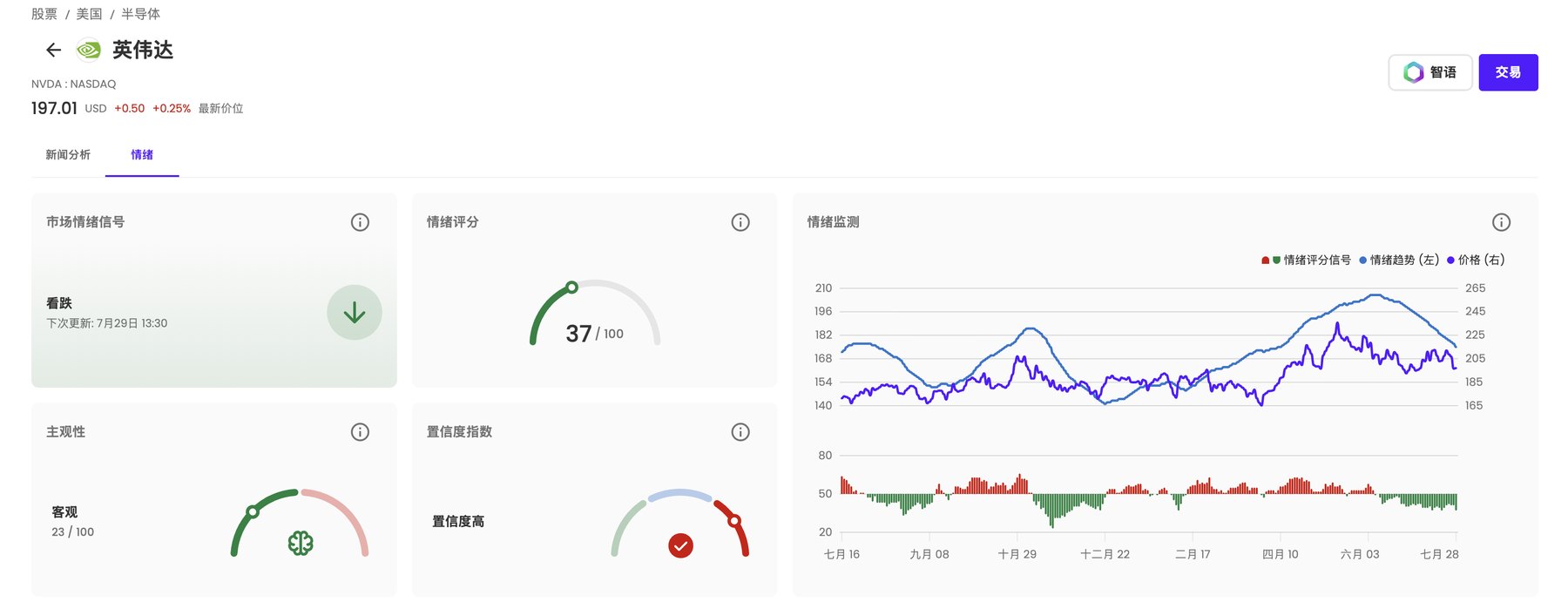
Success ≠ bullish. Error ≠ bearish.
In the Chinese market the colour convention is inverted — red reads as bullish, green as bearish. We learned this the real way: through user complaints. If success/error shared tokens with bullish/bearish, a "successful" state could look like a market crash. So they're decoupled tokens, localisable independently.
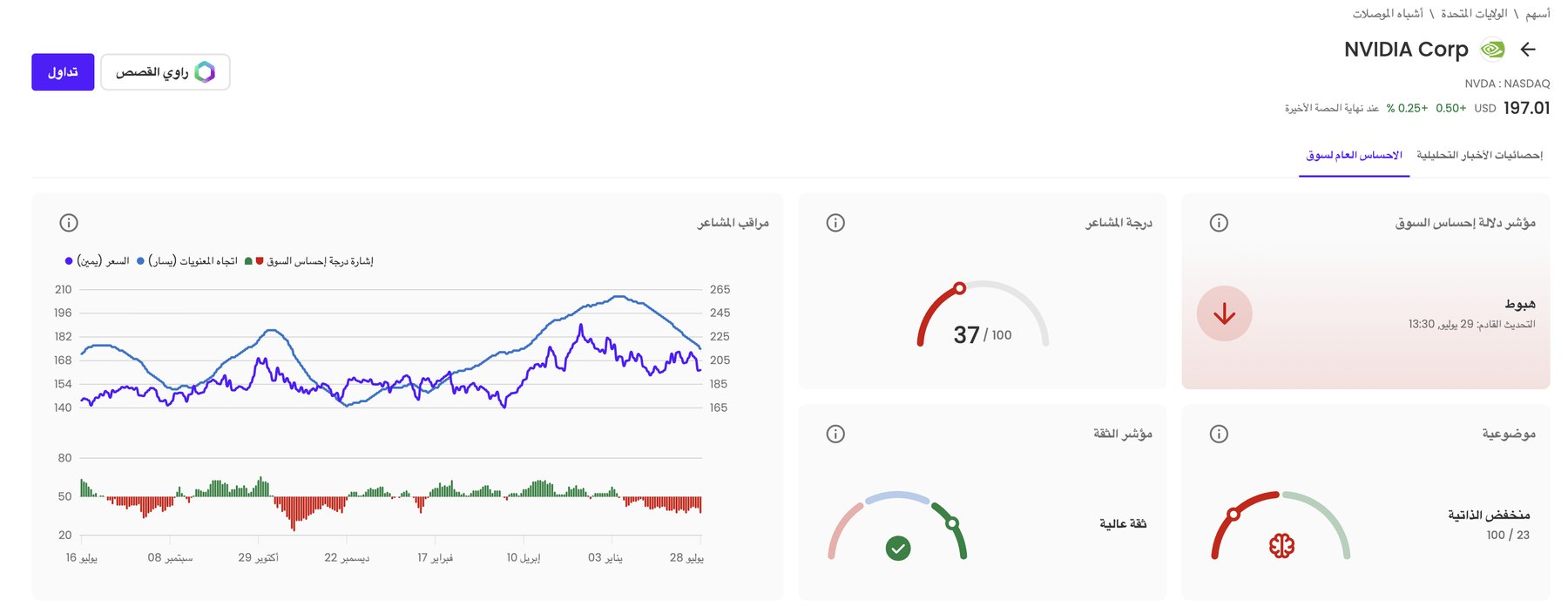
Direction isn't universal either
Arabic-market products run right-to-left, so components are built direction-aware from the token level up.
Typography
One single typeface across the system — one voice, fewer decisions, faster shipping.
Iconography at scale
The base set is Material Symbols — navigation, platform UI, features, and data visualisation stay consistent without reinventing a thousand glyphs. Custom work is saved for the domain-specific long tail nobody talks about: company logos, commodity icons, country flags. Same philosophy as the components: use the standard until the need is earned.
External sources as first-class citizens
Not everything is ours — charts in one product family come from the ChartIQ API. The system has to make third-party surfaces feel native rather than pretending they don't exist.
A custom illustration library
For an upcoming product, we built original illustrations for each chart pattern: embedded education, so users learn the pattern where they meet it.
Documented twice, on purpose
The system lives in both Figma and Storybook — designers and developers each get a source of truth in their native habitat, and the two stay in sync.
Five breakpoints, because reality said so
Desktop/tablet/mobile is a fiction when your analytics show users arriving from everywhere. Pulse standardises on five ranges:
| Breakpoint | Range |
|---|---|
| XL | > 1440px |
| L | 1200 – 1440px |
| M | 769 – 1199px |
| S | 393 – 768px |
| XS | < 393px |
Every data-heavy dashboard and widget in the family is specified against all five. Dense tables at 392px wide is exactly as fun as it sounds — which is why it's systematised instead of improvised.
Preset components couldn't flex
Angular Material's customisation ceiling kept blocking real product needs.
Selective migration — custom components only where need is proven, minimal overrides everywhere else.
A growing owned library — custom button, tables, filter section, bubbles / table / card views, donut charts, side panels, anticipated events, scrollbars, navigation — each one earned, none speculative.
Generic tokens couldn't describe the domain
"Primary/secondary/error" has no word for bearish.
A semantic token vocabulary built for fintech — market states, content domains, chart colours — shared across every product.
10+ products speak the same visual language; designers and devs reference meaning ("bullish"), not hex codes.
One system, many markets
Colour conventions invert across regions; reading direction flips.
Localisation at the token level — success/error decoupled from market colours, RTL-aware components.
The same system ships to markets with opposite colour semantics and opposite reading directions without forking.
Pulse is deliberately unfinished. The roadmap is to use AI more and more to scale it — accelerating token generation, documentation, and component variants, so the system grows faster than the products demanding it.
A design system isn't a deliverable. It's an ecosystem — and ecosystems are only done when they're dead.
Anna ✎