When the Chat Becomes the Navigation: Redesigning Vinted's Inbox
I love when a product breaks... just a little.
As an active Vinted user, I recently sold multiple items at once, and something that had always felt slightly off suddenly became very obvious: the chat is the seller's navigation system.
Even with just a few items, the friction is real. You scroll through conversations hunting for the right one, mentally mapping who said what about which item. It works. But it isn't smooth.
Scale it up and everything starts blending — buying vs. selling, quick questions vs. actual negotiations, active sales vs. completed ones. Finding a shipping label becomes a mini treasure hunt 🏴☠️
This isn't a bug. It's a scaling issue.
Two jobs wearing one interface
On Vinted, you are two people at once. As a seller, you're tracking items — who's interested, what's negotiating, what needs a shipping label. As a buyer, you're tracking conversations — where's my order, did they reply. Both live in the same inbox, and the inbox only knows how to do one of those jobs well.
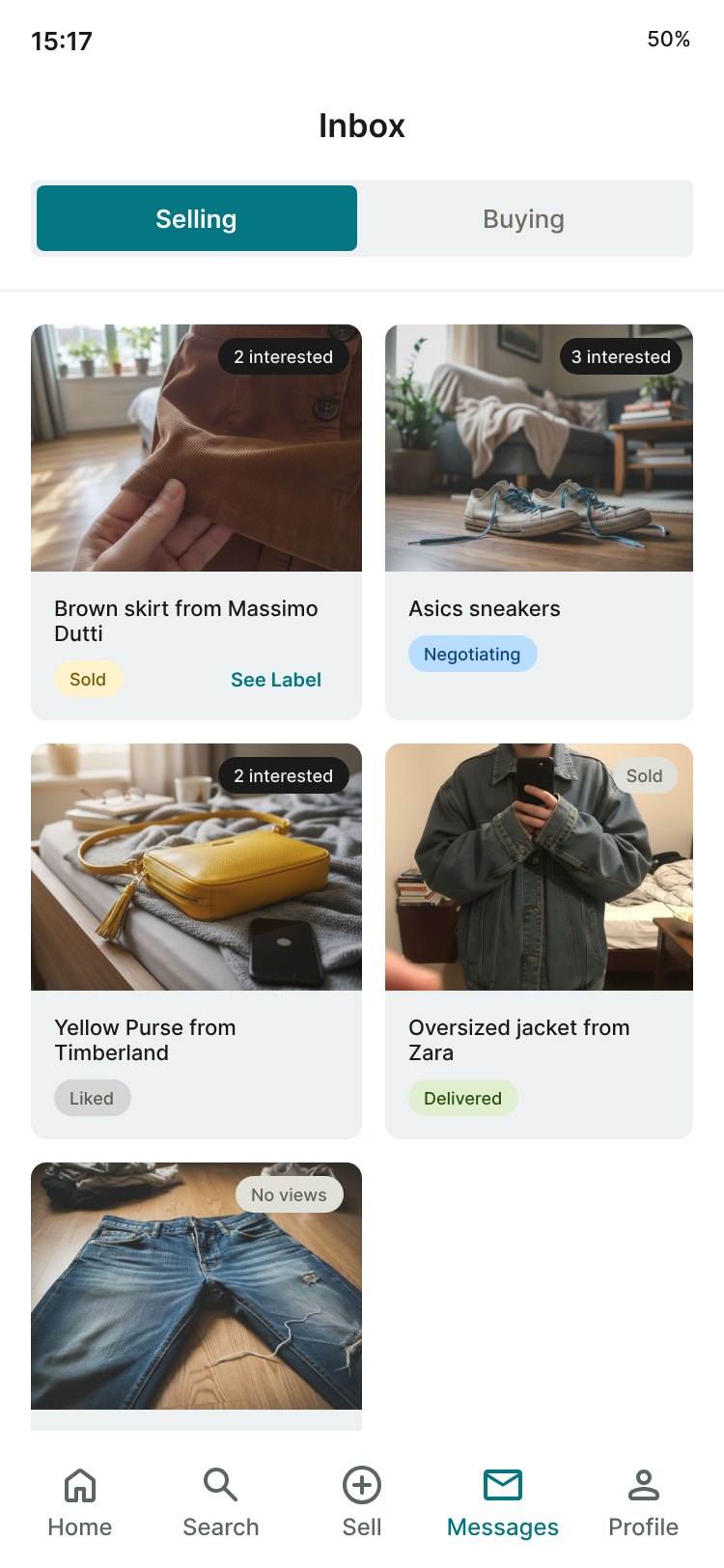
So I explored what it could look like if the experience shifted from chat-first to transaction-first: separating buying and selling flows, making status visible at a glance, and turning key actions into first-class elements instead of hiding them inside threads.
The core move: split the context, not the app
Rather than building a separate seller app or burying a filter in settings, the redesign puts a Selling / Buying toggle at the top of the inbox. One inbox, two contexts. The toggle keeps the mental model clean — sellers see their items, buyers see their conversations — and switching costs one tap.
Selling: an item-first grid
In the Selling context, the unit of attention is the item, not the message. Each item carries a status tag — Sold, Negotiating, Liked, Available, Delivered — plus an interest count ("2 interested", "No views"). A seller can triage the whole wardrobe at a glance instead of opening threads to remember where each conversation left off.
Status tags also do work that colour alone can't: they name the state in words, so the interface stays legible for colour-blind users and fast skimmers alike.
The contextual drawer
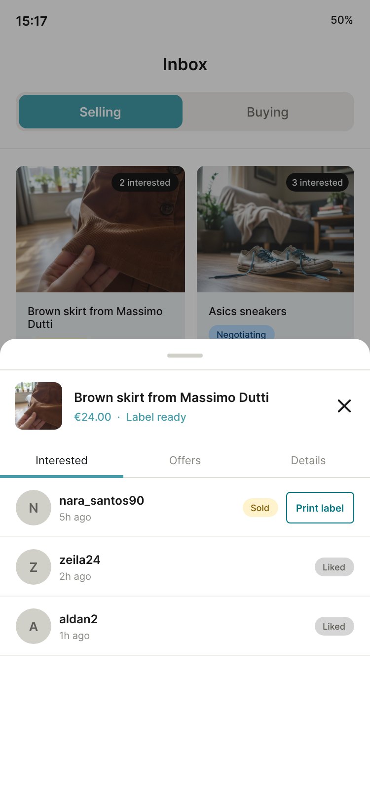
Tapping an item opens a bottom drawer with everyone interested in that specific piece — organised into Interested, Offers, and Details — with inline actions right where the decision happens. "Print label" sits next to the buyer who bought it. No treasure hunt, zero navigation.
Buying: keep it a conversation
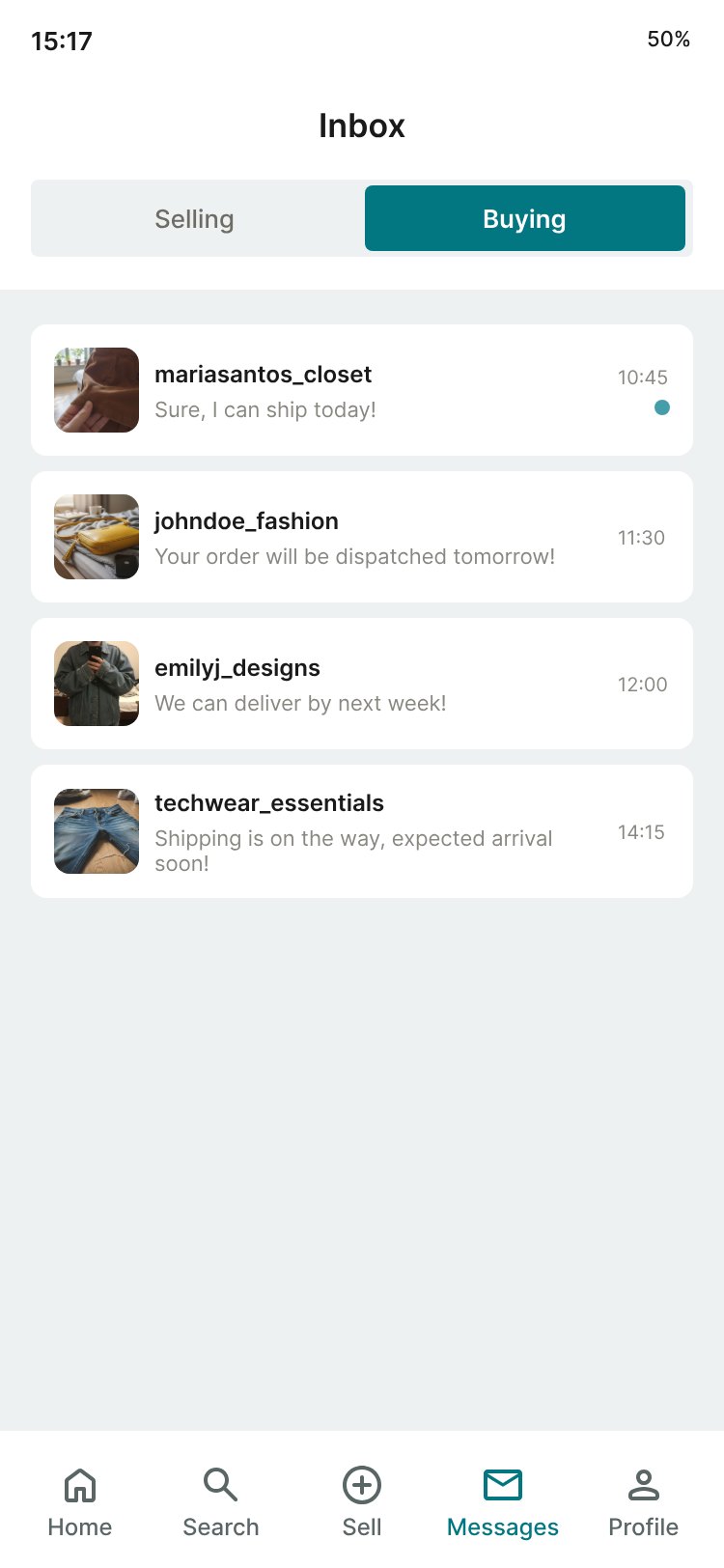
The Buying context stays deliberately familiar — a clean thread list with the latest message and timestamp. Buyers already have the right mental model here; the fix was simply removing the selling noise from their view. Not every side of a redesign needs reinventing. Restraint is a decision too.
What I'd test next
- Does the toggle default correctly? Someone who mostly sells shouldn't land in Buying every time.
- Do the status tags map to how sellers actually think, or are they platform vocabulary?
- Does the drawer scale for an item with 30 interested buyers, not 3?
- Is notification behaviour context-aware, or does it drag users across the toggle?
So — at what point does "just use the chat" become a design failure?
unaffiliated concept — just a designer who sells too much on Vinted