The Floor Is the Interface
I just got back from a vacation in South Korea with my sisters: Seoul, Jeonju, Gyeongju and Busan. The plan was simple. Eat everything, see everything, rest my brain.
My brain had other plans. As a UX/UI designer, I can't switch off the part of me that notices why something works, or why it doesn't. And in Korea, that part of me was working overtime.
We tend to talk about UX as if it lives inside screens: apps, websites, onboarding flows. But user experience is everywhere. It's the crosswalk you wait at, the bus stop you shelter in, the door that makes you wonder whether to push or pull (hi, Don Norman). Someone designed every one of those moments, or decided not to.
So this article isn't about a Korean app redesign. It's about the everyday, mostly non-digital UX I kept spotting on the streets, in the metro and, yes, in the bathroom. And about what Portugal, where I live and design, could learn from it.
The mirror in the stall
The most interesting piece of UX I found in South Korea was inside a public toilet in Gyeongju.
You know the classic stall: walls that stop a few centimetres short of the floor and the ceiling. Portugal has them too. In this one, the gap at the bottom was sealed with an extra panel, and the gap at the top was covered with transparent vinyl. Then, right in front of me, there was a small gadget with mirrors set at three different angles.
It took me a second to get it. The mirrors let you check, from the toilet, whether anyone is pointing a camera at you through a gap. It's a brilliant piece of design. It's also a grim one, because nobody builds that unless it has already happened.
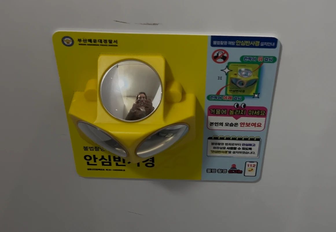
That little gadget became the lens for the rest of my trip. Over and over, I noticed the same thing: Korea doesn't design for the ideal user. It designs for the human who actually shows up. Distracted, lost, sweaty, scared, or unable to speak a word of Korean (hi, it's me).
Here's what that looks like in everyday life, and what Portugal could learn from it. Spoiler: the first lesson is on the floor.
Designing for the distracted user
So, the floor. In Korea, people look at their phones. Constantly. AirPods in, head down, scrolling through the crosswalk. There's even a word for it: smombie, a smartphone zombie.
Most cities would answer this with a campaign. Posters, a stern slogan, maybe a fine. Korea did something much more designer-coded: it moved the interface to where people were already looking.
At many crosswalks, the traffic light isn't only up on a pole. It's also a strip of LED light on the ground, red when you wait and green when you go. Bike lanes get the same treatment, with lights projected onto the path. If your eyes are on your screen, the signal still lands in your peripheral vision. It's basically a push notification for your feet.
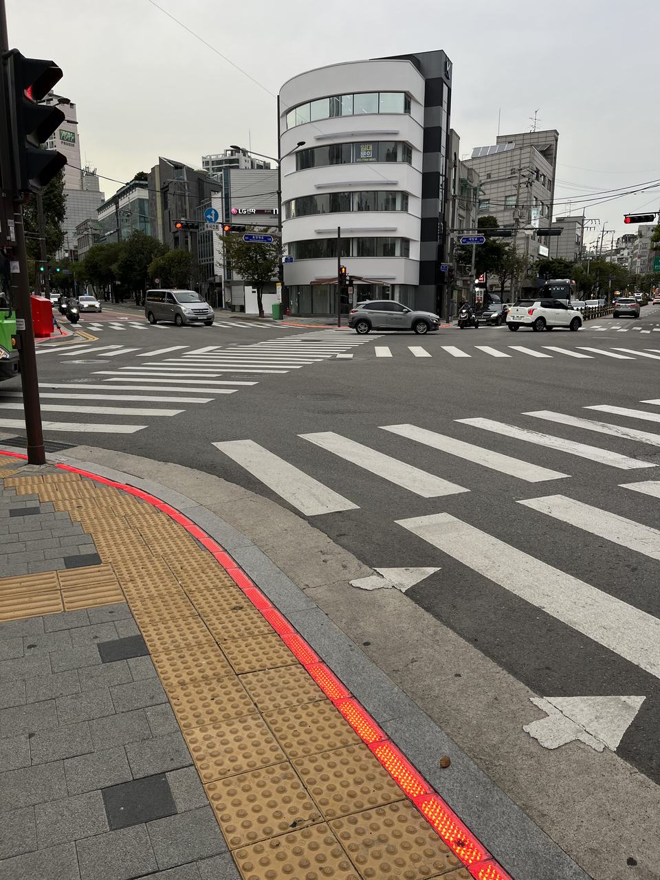
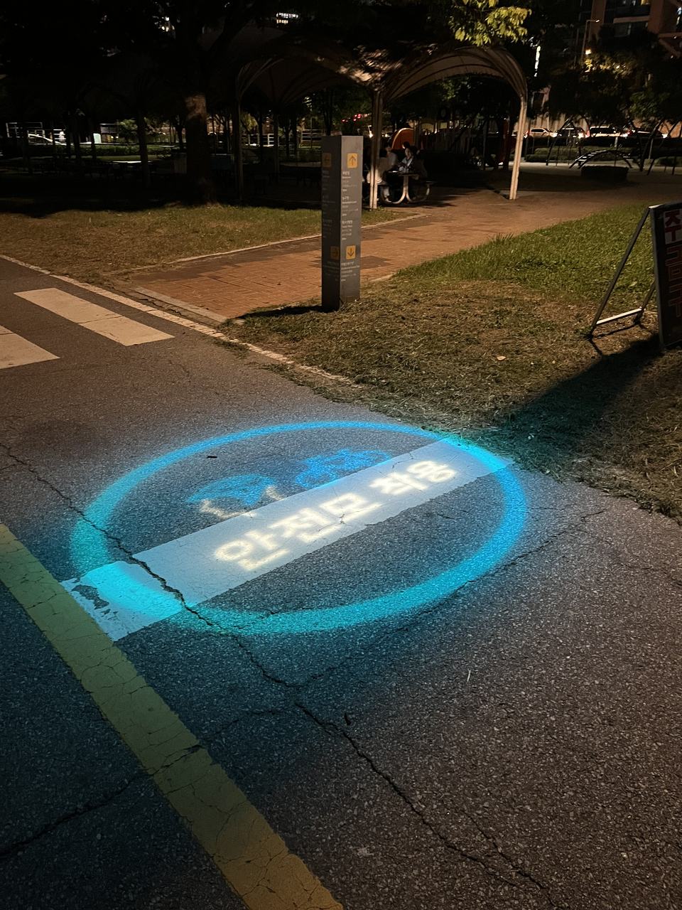
Is it a little sad that a country needed traffic lights on the floor? Sure. But as a designer, I can't stop admiring the honesty of it. Nobody pretended users would change. The system changed instead.
That's the lesson I keep relearning at work: you can design for the behaviour you wish people had, or the behaviour they actually have. Only one of those ships. And once I started looking for that honesty, I saw it in how Korea handles the next problem too: getting people where they're going.
Information before you need it
Getting people safely across a street is one thing. Getting them through a giant metro system without stress is another, and here Korea does something sneaky: it answers your question before you've finished asking it.
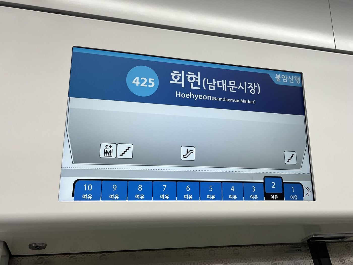
The subway knows where you're standing. As the train approaches a station, the screen inside the carriage shows a map of that specific platform. It tells you which carriage you're in, and where the escalators, elevators and plain stairs are relative to you. It changes at every stop. By the time the doors open, you already know whether to turn left or right. No platform shuffle, no blocking the crowd while you squint at signs. Progressive disclosure, but make it public transport.
The map app lets you choose your pain. The carriage screen helps once you're on the train, but planning the route is your phone's job. Google Maps barely works in Korea, so I switched to Kakao Map, and it ruined other map apps for me. Korean metro stations have a lot of stairs. Kakao lets you choose a route with the fewest stairs, even if it means walking further. It then tells you which entrance to use, which carriage to board and which exit to take.
On paper, that's an accessibility feature. In practice, it's for everyone: people in wheelchairs, parents with strollers, anyone dragging a suitcase, and me on day six with destroyed calves, for whom Kakao was essentially a "skip leg day" button. It's the curb-cut effect in app form. Design for the edge case and you quietly help the majority.
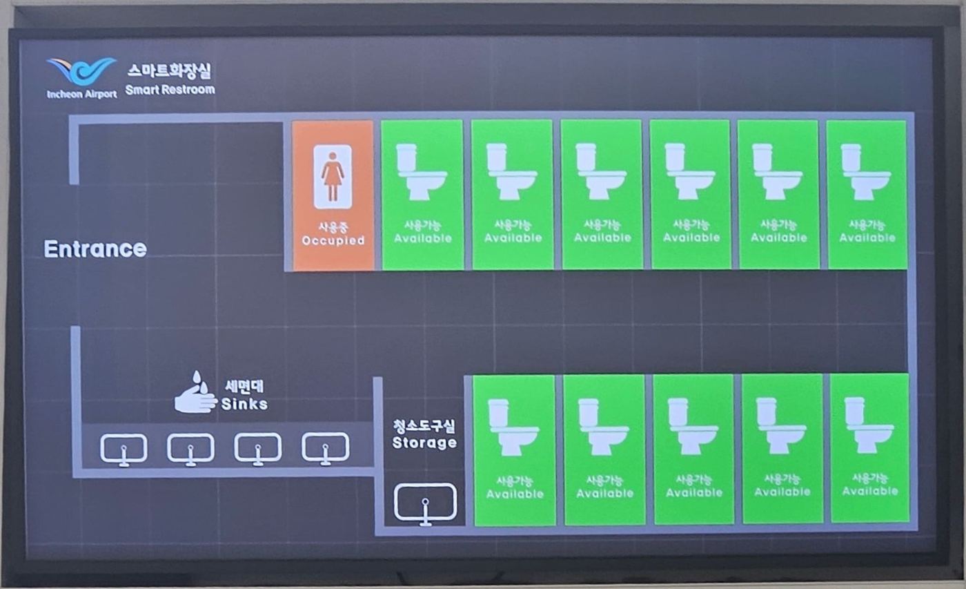
Even the toilets have a live status. Honestly, I should have seen this coming from the moment I landed. At the airport, a screen outside the bathroom shows which stalls are free in real time, plus when the occupied ones became occupied. It's a little weird, basically a status page for bathrooms (uptime not disclosed). It's also an incredibly calm way to avoid the awkward stall-door-pushing tour.
And there's nothing to lose. Sometimes the smartest way to reduce friction is to remove the object entirely. Almost every door I opened, from accommodation to shared spaces, used a keypad instead of a key. No keys to forget, no key to hand over at 11 pm, no lockout panic. Korea removed the key the way a good form removes an optional field: nobody misses it. Add tap-to-pay everywhere and a pattern appears: Korea keeps deleting the small physical anxieties of daily life. The best interface is the one you never have to carry. All of this gets you where you're going faster. But even in Korea, at some point, you still end up waiting.
Public space as comfort
In Portugal, waiting is something you endure. In Korea, waiting is something somebody designed.
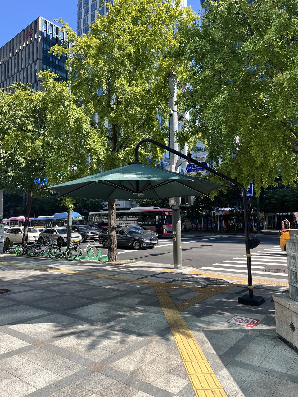
Shade at the crosswalk. At many crossings there are giant umbrellas planted right where people wait for the green light. That's it. That's the feature. Zero lines of code, maximum UX. Anyone who has waited at a Lisbon crossing in August, slowly cooking from the scalp down, understands why I nearly cried.
Bus stops with climate control. The same care extends to the bus stop. Some are fully enclosed glass boxes. At first I assumed they were smoking rooms. Wrong. They're heated in winter, air-conditioned in summer, and you can charge your phone while you wait. Your bus stop is now a tiny lounge. It's the real-world version of a skeleton loader: you're still waiting, it just feels a lot better. I would happily pay taxes for this. I already pay taxes, just not for this.
A bin on the bus. And when the bus finally arrives, the thoughtfulness rides along with you. The buses I took had trash cans on board. Tiny detail, huge effect: when the bin exists at the exact moment you have rubbish, you don't leave rubbish. Good UX puts the right affordance at the moment of need, not three streets away.
None of this is high-tech. Umbrellas and bins aren't innovation. The innovation is that someone stood where the user stands, felt what they feel, and fixed it. That's a user journey map, built out of street furniture. Comfort is one way a city takes care of you, though. Feeling safe is another, and that's where things got more complicated.
Safe by design, watched by default
Korea felt like one of the safest places I've ever been, and the more I paid attention, the more I realised that safety had been designed too. I'd have happily walked home alone at night (I was with my sisters, so technically I never tested it, but the vibe was there).
The stall mirror from the intro is one side of that safety: the system assumes something bad could happen and gives you a tool to check. The other side surprised me more.
The washing machine trusted me completely. At our hostel in Gyeongju, the laundry room had washing machines and no obvious way to pay. We were confused until we spotted a small station at the back of the room with a sign: pay here. Nothing stopped us from running a load and walking away. No staff, no lock, no coin slot. It was an honour system, and it worked.
Meanwhile, everything is on camera. CCTV is everywhere in Korea. For the first two days I felt constantly watched. Then I just... stopped noticing. If anyone wanted to, they could probably reconstruct every place my sisters and I entered and left on the entire trip.
My theory, after two days of feeling watched: the visible trust and the invisible cameras are connected. When everything is recorded, you can afford to leave the laundry unguarded. Korea's trust culture surely has deeper roots than surveillance, but in UX terms the cameras act like trust infrastructure. You don't see it, but it's holding the whole experience up.
The same feeling showed up when I filmed. I recorded the whole trip for a vlog, and people barely reacted to my camera. In Portugal, people actively dodge out of frame. In Korea, at least in the moment, nobody seemed to mind. Then I learned that Korea has strong portrait-rights norms, which is why Korean TV and YouTube routinely blur passersby. So "nobody minds" is apparently a lot more complicated than it looked. Lesson learned, faces will be blurred.
So which is better: a society that watches everything and trusts everyone, or one that watches less and trusts less? I genuinely don't know. As designers, though, we make this exact trade-off every time we add tracking to "improve the experience." Korea just shows what it looks like at the scale of an entire country. And as I was about to find out, a system built that tightly around its own people works beautifully, until you're not one of them.
Seamless, for insiders
Korea has a reputation for not having many English speakers, so I expected to be lost. Instead, almost every sign I saw had English on it. Navigation was rarely the problem. Talking was.
The kiosk that won me over. Nearly every coffee shop had a self-ordering machine. My first reaction was a bit judgy: isn't this just removing human contact? By the end of the trip I'd completely flipped. None of us spoke Korean. The kiosk let us order exactly what we wanted, in English, without pointing and hoping (a strategy with a famously low conversion rate). The staff could focus on making the order instead of decoding three confused Portuguese women. Faster for them, less stressful for us.
What I found most interesting wasn't the machine, though. In-person interactions often felt reserved, partly because of the language gap. Yet when you text with Korean people, they're incredibly warm: emojis, stickers, enthusiasm everywhere. The warmth didn't disappear. It moved channels. KakaoTalk carries a lot of the expressiveness that, in Portugal, we put into a chat with the waiter. That's a reminder that interfaces don't just serve culture. They reshape where it lives.
Then I hit the wall. Here's the plot twist. The same ecosystem that made ordering effortless also locked me out. Many apps and services required a Korean phone number to sign up. We didn't have one. So I spent my whole trip in the country famous for delivering fried chicken basically anywhere, and I couldn't order a single drumstick.
That's the most important lesson of the whole trip for me. Frictionless for insiders can mean impossible for outsiders. Every onboarding flow that requires a local number, a national ID or a specific bank quietly decides who your product is not for. Korea's everyday UX is world-class, as long as you're already inside it. Which, in a slightly uncomfortable way, brought me right back home.
Lisbon, look down
So let me be clear: this isn't a "Korea good, Portugal bad" story. Portugal has real UX wins. MB Way and the Multibanco network are genuinely excellent, and plenty of countries would love our payment experience. Our slower, human service is a feature too, especially for older people who don't want to fight a kiosk to get a coffee.
Still, if I could smuggle three things back in my suitcase (customs, please look away), they'd be these:
- Shade at crossings. Low cost, zero tech, and a real difference to how a summer city feels.
- Platform-aware metro screens. Tell me which carriage I'm in and where the lift is before the doors open. Our stations would instantly feel calmer.
- Stair-free routing in transit apps. Build for wheelchairs and strollers, and everyone with a suitcase or tired legs wins too.
And one thing I'd leave behind: the phone-number wall. A great experience that only works for locals isn't a great experience. It's a private one.
The biggest takeaway, though, is a mindset rather than a feature. Korea keeps meeting people where they are. Heads down? Put the light on the floor. Lost? Show the exit early. Scared? Give them a mirror. Good design rarely asks users to become better versions of themselves. It just looks at what they're already doing and quietly makes it work.
Consider this article my pull request to the city. Lisbon, please approve, and look down. The floor is the interface.